Every cycle has a moment when the smartest money moves quietly. You see the price barely budging while news headlines scream doom. Yet beneath the surface, coins are leaving exchanges in massive waves. That contradiction is the fingerprint of a bitcoin accumulation zone. Learning to read that fingerprint using exchange flow data can give you an edge most retail traders miss entirely. It turns guesswork into a repeatable process.
Bitcoin accumulation zones form when large investors buy coins from exchanges without pushing price higher. Exchange flow data reveals these zones through patterns like sustained outflows, dropping exchange balances, and rising whale wallet counts. By tracking net flow, exchange balance metrics, and Coin Days Destroyed, you can distinguish real accumulation from noise and time entries near cycle lows.
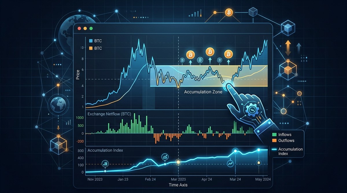
What Actually Is a Bitcoin Accumulation Zone?
An accumulation zone is a price range where institutional players and long term holders systematically buy bitcoin over days or weeks. The price typically stays flat or moves sideways. This sideways action hides the buying pressure. Unlike a breakout where volume spikes and price rips upward, accumulation feels boring. That boredom is the point.
Exchange flow data makes this invisible process visible. When bitcoin moves from exchange wallets to private wallets, it signals intent to hold. When it moves onto exchanges, it signals intent to sell. Tracking those movements over time reveals whether the market is in a distribution phase (selling) or an accumulation phase (buying).
The chart below shows the basic relationship you want to look for:
| Metric | Accumulation Phase | Distribution Phase | Neutral Market |
|---|---|---|---|
| Exchange balance trend | Steady decline | Steady increase | Flat or mixed |
| Net flow (30-day) | Mostly negative | Mostly positive | Near zero |
| Whale wallet count | Rising | Falling | Flat |
| Price action | Sideways, low volatility | Rising with high volatility | Range bound |
| Coin Days Destroyed on spikes | Low (old coins not moving) | High (old coins moving to exchanges) | Moderate |
Why Exchange Flow Data Works Better Than Price Patterns
Price patterns can fool you. A double bottom might be a real reversal or just a pause before another leg down. Exchange flow data goes straight to the source: what holders are actually doing with their coins.
In 2026, the on-chain infrastructure is more transparent than ever. You can see exactly how much bitcoin leaves Coinbase, Binance, or Kraken in near real time. When you combine that with wallet age analysis, the signal becomes even stronger.
Let me give you a real example. In late 2025, bitcoin traded in a tight range around 62k for almost six weeks. Sentiment was miserable. But exchange balances dropped by nearly 400,000 BTC during that same window. That was a textbook accumulation zone. Six months later, price had moved past 100k. The on-chain data caught the story before the price did.
The Core Metrics You Need to Track
You do not need a wall of monitors or a PhD in data science. You need four metrics and the ability to look at them together.
Exchange Net Flow
This is the most direct signal. Net flow measures the difference between bitcoin deposits to exchanges and bitcoin withdrawals from exchanges over a set period. A sustained negative net flow over 7, 14, or 30 days means coins are leaving exchange wallets.
A single day of negative flow means nothing. A consistent pattern over weeks is where the signal lives.
Exchange Balance
This is the total amount of bitcoin sitting on all tracked exchanges. When the exchange balance drops to multi-year lows while price stays flat, you are likely in an accumulation zone. When balance rises with price, be careful. That usually means holders are preparing to sell.
Whale Wallet Accumulation
Track wallets that hold 1,000 BTC or more. When those addresses increase their holdings during a flat price period, it strongly suggests smart money is building positions. You can find this data on platforms like Glassnode or look at wallet clusters through blockchain explorers.
Coin Days Destroyed (CDD)
CDD measures how many days coins stayed dormant before moving. A spike in CDD means old coins are waking up. During a real accumulation zone, CDD stays low or moderate because long term holders are not selling their oldest coins. If CDD spikes while price is flat, it could signal distribution disguised as accumulation.
How to Spot a Real Accumulation Zone: A Practical Process
Here is a step by step process you can run every week. It takes about 15 minutes once you set up your data sources.
-
Check the 30-day exchange net flow. Open your on-chain dashboard and look at the trailing 30-day net flow for bitcoin. If it is negative by more than 50,000 BTC, that is a strong signal. If it is negative by more than 100,000 BTC, pay close attention.
-
Compare net flow to price action. Is price in a range or making lower highs? If the flow is negative and price is not rising, you have a divergence. That divergence is the accumulation signal.
-
Look at the exchange balance trend. Zoom out to a 6-month or 12-month chart of total exchange balances. Is the line sloping downward? If yes, and price is flat or falling, the zone is likely active.
-
Check whale wallet counts. Open the whale address count metric. Are wallets with 1,000+ BTC increasing? If whale counts are rising while smaller wallets are selling, the story is clear.
-
Validate with CDD. Look for any sudden CDD spikes. If CDD is quiet and your other three metrics show accumulation, the signal is clean. If CDD is spiking, wait for confirmation.
-
Set a watch range. Mark the current price zone on your chart. If the data supports accumulation, set alerts for a 10% drop below that range. Smart money often shakes out weak hands before moving higher.
Common Mistakes That Mislead Traders
Even experienced traders get tripped up by these traps. Avoid them and your accuracy will improve noticeably.
- Mistaking one big outflow for a trend. A single whale moving coins to cold storage can create a one day negative spike. Wait for consistency over at least two weeks.
- Ignoring ETF flows. In 2026, spot bitcoin ETFs hold over a million BTC. ETF inflows and outflows can offset or amplify exchange flow signals. Always check both.
- Using only one exchange. Some exchanges are more popular with retail, others with institutions. Use aggregate data whenever possible.
- Forgetting about derivative exchanges. Coins flowing to Binance Futures or Bybit might be used as margin, not sold. Separate spot exchange flows from derivative exchange flows.
Here is a handy comparison of techniques and the mistakes that undermine them:
| Technique | Common Mistake | How to Fix It |
|---|---|---|
| Watching net flow | Reacting to daily spikes | Use 7-day or 30-day moving average |
| Checking exchange balance | Not adjusting for new exchange listings | Track exchange balance as a percentage of circulating supply |
| Tracking whale wallets | Including exchange wallets in whale count | Filter out known exchange addresses |
| Using CDD | Looking at raw CDD instead of CDD ratio | Use the CDD ratio to normalize for price |
“The biggest mistake traders make is treating accumulation zones as a single point. They are zones. They last weeks or months. Patience is the actual skill, not prediction.” — On-chain analyst observing 2024 and 2025 cycles
Tools to Simplify Your Exchange Flow Analysis
You do not need to run a node or write SQL queries. Several platforms give you clean dashboards with the exact metrics listed above. Some of the most useful ones in 2026 include:
- Look at the exchange flow overview on https://bituki.io/5-bitcoin-on-chain-metrics-that-signal-market-tops-and-bottoms/ for a high level snapshot of where bitcoin is moving.
- Use the whale accumulation tracker on https://bituki.io/essential-bitcoin-metrics-every-investor-should-monitor-daily/ to see whether large wallets are growing.
- Set price alerts combined with on-chain triggers on https://bituki.io/top-tools-for-real-time-bitcoin-price-alerts-and-monitoring/ so you never miss a zone shift.
Each of these tools gives you a different angle on the same story. Using them together builds confidence in your reads.
How to Scan the Market for Accumulation Zones Every Week
Developing a scanning routine keeps you from chasing price and lets you see the setup forming before it becomes obvious. Here is a simple weekly scan:
- Start with the aggregate exchange balance chart. If the line is trending down, mark it.
- Then check the top 10 exchanges individually. Sometimes one exchange shows outflow while another shows inflow.
- Look at the 30-day net flow histogram. Green bars (outflows) that are tall and consistent are your target.
- Scan whale wallet counts for the last 30 days. A steady upward slope is ideal.
- Check the CDD ratio. Low values suggest conviction. High values suggest indecision or distribution.
- Cross reference with the bitcoin price chart. Are we near a previous support level? That strengthens the zone.
If you want to go deeper, https://bituki.io/mastering-bitcoin-market-trends-with-advanced-insights/ covers how to layer in macroeconomic context and sentiment data to validate your on-chain reads.
The Psychological Side of Accumulation Zones
Accumulation zones feel terrible to trade. Price does nothing exciting. Social media flips bearish. Friends tell you bitcoin is dead. That is the whole point.
If accumulation felt good, everyone would do it. The reason exchange flow data is so powerful is that it removes the emotion. When your dashboard shows consistent outflows and falling exchange balances, you have a factual basis to stay calm. You can tune out the noise.
In the 2022 bear market, exchange balances dropped by roughly 600,000 BTC while price crashed from 69k to 16k. That was one of the clearest accumulation zones in bitcoin’s history. Most people missed it because they were too scared to look at the data.
Bringing Exchange Flow Data Into Your Trading Plan
You do not need to change your whole strategy. Just add one layer. Before you open a long position, check the 30-day net flow. If it is positive (inflow), ask yourself why you are buying while other holders are sending coins to exchanges. If it is negative (outflow), your trade has a tailwind from on-chain behavior.
The same logic works for exits. If you are holding a position and see sustained positive net flow while price is pumping, start scaling out. You are likely near a distribution zone.
For a complete framework, https://bituki.io/how-to-analyze-bitcoin-market-cycles-for-better-investment-timing/ walks through how to align exchange flow readings with cycle phases and investor sentiment.
Your Next Move
Start small. Pick one metric from this article and watch it for the next 14 days. Write down what you see. Compare it to price action. Notice how often the data tells a different story than the headlines.
As you get comfortable, add a second metric. Eventually you will build a dashboard that tells you when bitcoin is being accumulated before the price reflects it. That is the edge.
Exchange flow data turned bitcoin accumulation zones from a vague concept into something you can measure. Now it is up to you to use it. Set your alerts, check your dashboards, and let the data guide your next move.